...
- Widgets which can be displayed but a) have disadvantages to the recommended widgets or b) are rarely used are part of this list.
- A disadvantage could be:
- Uncommon design pattern (e.g. using Radio Buttons for multi selectable Questions)
- Reasons for rarely used:
- Widgets which are used for one specific use case which cannot be decided by the configuration itself (e.g. displaying an enumeration list).
- Widgets which needs need additional custom content to to look like expected.
- All of them have a lover fit score than the widgets from the recommended list and are internally sorted by this score. That means the further left the better.
...
The view is segmented into 3 main parts:
These segments have a logical order. That means that you should first select the right theme, then the Question and afterwards the widget.
| Anchor | ||||
|---|---|---|---|---|
|
Each theme contains a different set of widgets. Hence not every widget is available in one theme. Therefore please make sure that you have selected the right theme before you start choosing your widgets.
| Info | ||
|---|---|---|
| ||
All widget changes are stored automatically after the selection. So do not be afraid to change the theme. No selection will be lost. |
| Anchor | ||||
|---|---|---|---|---|
|
On the left-hand side within the blue bordered box you can select a Question. These Questions are structured within a tree layout. That means that like in the Language view you can navigate through the Stages to find the right Question.
...
| Info | ||
|---|---|---|
| ||
The corresponding Answer Options are displayed but disabled (means not clickable). They should help you to remember and decide which widget is the most suitable. |
| Anchor | ||||
|---|---|---|---|---|
|
Next to the question selection, the widget selection card is positioned. It is the main part of the view because it contains all selectable widgets for the selected Question.
...
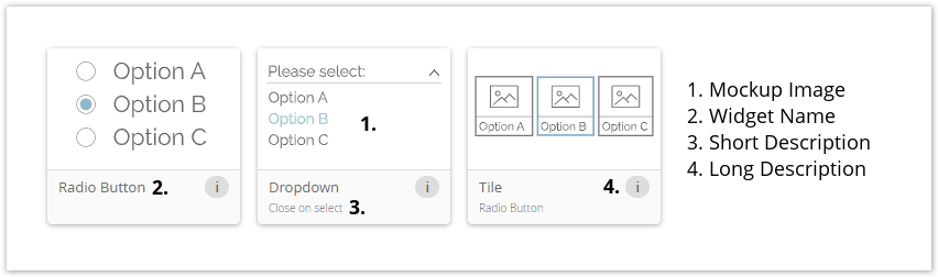
- On top you can see a mockup image of the widget. This image contains the main elements of the widget. These serve for identification and comparison with others.
 Note: The image is not a real representation in the client theme. That means that it can look different in the various themes.
 - Below the image the widget name is placed. That is the common name excentos uses for this widget.
- The short description contains some detailed information about specific widget functionalities or additional elements. If the widget has neither of them, this label is invisible.
- For dropdowns a functionality could either be "Close on select" (closes the answer option selection after one option was chosen) or "Remains open on select" (answer option selection is not closed after an option selection).
- For tiles the information Radio Button or Checkbox because that is the only difference for these widgets.
- The long description becomes visible by hovering over the info button. It contains more detailed information about the widget.
| Anchor | ||||
|---|---|---|---|---|
|
The default widget is the first selected widget for each Question and is always visible as the first widget in the recommendation list. The selection is based on the Question configuration. You can always go back to this widget by clicking the "Reset to Default" button.
...